Why a Single-Colour Column Lengthens Legs and Exactly Where It Stops Working
Quick Answer: An unbroken column of one colour lengthens the leg because the eye reads uninterrupted colour as a single continuous shape, and horizontal contrast breaks are what create the perception of separate, shorter segments. It stops working at three predictable points: when the shades are near-but-not-matching, when the texture changes mid-column, and when the shoe breaks the line at the ankle. Fixing those three is most of the technique.
The advice is right. The execution is where it goes wrong.
And it goes wrong in the same three places almost every time, which makes it easy to fix once you know where to look.
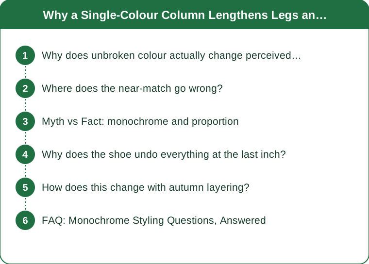
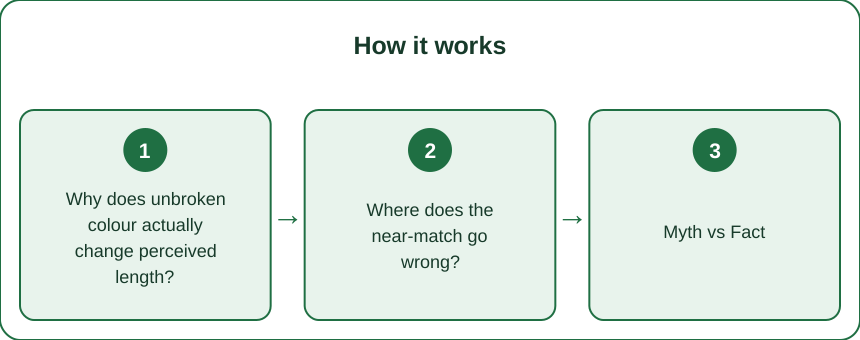
Why does unbroken colour actually change perceived length?
Because of how the visual system finds edges.
Your eye locates boundaries primarily through contrast — differences in lightness and colour. Where there is a strong contrast line, the brain registers an edge and treats what is above and below as separate objects.
So a dark top over light trousers creates a horizontal edge at the waist. The brain reads two shapes: torso and legs. The leg shape starts at the waist and is measured from there.
Remove the contrast and the edge disappears. Now there is one continuous shape, and the eye has nothing to measure segments against. The result is a perception of length that is not about the actual proportion at all — the legs did not change, the measurable reference points did.
This is the same mechanism behind two related effects:
Vertical lines lengthen because they guide the eye along the body’s long axis rather than across it.
Horizontal breaks shorten wherever they occur, which is why a contrasting waistband, a cuffed hem, or an ankle strap all cost length at their specific height.
Does this only work in dark colours?
No. The effect comes from the absence of contrast, not from darkness. A full cream column works exactly as well as a full black one — it just shows fabric differences more, which matters for the next section.
Where does the near-match go wrong?
This is the most common failure, and it is worse than making no attempt at all.
When two pieces are almost the same colour but not quite, the small difference does not read as a subtle tonal choice. It reads as an error, and the eye is drawn straight to the boundary — which places a high-attention horizontal line exactly where you were trying to remove one.
The usual culprits:
Two blacks that have aged differently. Black fades toward brown or toward grey depending on the fibre, and a two-year-old black legging beside a new black top is visibly two colours in daylight.
Navy and black together, which look identical indoors and separate completely in natural light.
Different fibre content in the same dye colour. Polyester and cotton take dye differently, so a cotton tee and a polyester legging in the same nominal shade are usually a slight mismatch.
What to do instead:
- Either match precisely or go clearly tonal. A definite two-shade gradient — light to dark, or dark to light — reads as intentional and still avoids a hard contrast edge.
- Buy the pieces together where you can, in the same fabric family.
- Check the match in daylight, not under warm indoor bulbs, which flatten differences you will see outside.
Myth vs Fact: monochrome and proportion
Myth: Only black works for lengthening. Fact: The effect is contrast-based, not colour-based. Cream, camel, olive and grey columns all work. Black is simply easier to match across garments.
Myth: Monochrome means everything must be identical. Fact: A tonal gradient in one colour family works just as well and is often more interesting. What fails is the near-match, not the deliberate shade shift.
Myth: Texture does not matter if the colour is right. Fact: Texture changes how much light a surface reflects, and a matte-to-shiny change in the same colour creates a visible boundary. A ribbed knit and a smooth legging in identical black still show a line.
Myth: A belt ruins the column. Fact: A belt in the same colour is nearly invisible and can add shape. A contrasting belt is the single most expensive horizontal line you can add, because it sits at the highest-leverage point.
Myth: Tall people do not need this. Fact: The technique changes perceived proportion, not height. Anyone whose torso is long relative to their legs gets the same benefit regardless of overall height.
Myth: The shoe colour is a minor detail. Fact: It is arguably the biggest single variable, and it is covered next.
Why does the shoe undo everything at the last inch?
Because it is the end of the column, and the eye finishes measuring there.
If you build a perfect unbroken line from shoulder to ankle and then put a contrasting shoe on the end, you have created a hard edge at the ankle — the exact point where the leg’s visible length is decided.
The effect is substantial and it is the most commonly wasted effort in the whole technique.
The hierarchy of what works, best to worst:
- Shoe matching the trousers. Maximum extension. The column continues to the floor.
- Shoe matching skin tone, if there is bare ankle. The eye reads it as a continuation of the leg.
- A low-cut vamp — a shoe cut low at the toe box shows more foot, and more visible foot reads as more leg. This is why a low-vamp flat lengthens more than a high-cut one in the same colour.
- A neutral that is close to the trouser tone, which is a compromise but a workable one.
- A hard contrast shoe, which caps the leg. Sometimes the right style choice, but be aware you are paying for it.
And the sock question, which is the same problem one layer up: a sock that contrasts with both trouser and shoe adds a second horizontal line in the worst possible place. Match the sock to the trouser, or to the shoe, and never to neither.
What about ankle straps?
They cut the line at the narrowest, most valuable point. If you love them, accept the trade and lengthen elsewhere — a higher rise, a longer hem.
How does this change with autumn layering?
The technique gets easier in one way and much harder in another, and the shift starts now.
Easier: autumn adds outerwear, and a long coat in the column colour is the most powerful lengthening tool available. A coat that falls below the knee in the same tone as the trousers extends the vertical line further than any styling trick, and it hides the waist break entirely.
Harder: every layer is a chance to introduce a mismatch, and autumn fabrics vary enormously in texture. Wool, knit, leather, denim and technical fabric all reflect light differently, so a tonally correct autumn outfit can still show three visible boundaries.
What to do as the layers go on:
- Keep the vertical layers open. An open coat or cardigan creates two long vertical lines down the sides, which is a lengthening effect in its own right. Buttoned closed, the same coat creates a horizontal hem line.
- Match the boot to the trouser for the season’s biggest single win. A cropped trouser with a contrasting boot is the most common autumn proportion mistake.
- Watch out for the tucked-in scarf, which adds bulk and a horizontal edge at the chest, shortening the whole upper column.
- Tights in the trouser or skirt colour rather than in a contrasting shade, for the same reason as socks.
Seasonally, right now is the moment to sort this out, because the autumn pieces are going into rotation over the next few weeks and matching is far easier to do once, in daylight, than to improvise on a cold morning.
Does a scarf always shorten?
No. A long scarf hanging in two vertical lines lengthens. It is the bulky wrapped version that creates the horizontal.
FAQ: Monochrome Styling Questions, Answered
Is monochrome boring?
It only reads flat when the texture is also uniform. One colour across three different textures is the version that looks considered rather than plain.
What is the easiest colour to build a column in?
Charcoal or a mid-grey, because grey fades less unpredictably than black and matches more easily across fabric types.
Does this work with prints?
A print in a tight tonal range behaves like a solid at a distance. A high-contrast print creates its own internal horizontal lines and works against you.
How high should the waistband be?
Higher raises the apparent start of the leg, which helps, but only if there is no contrast at that point. A high waist in a contrasting colour actively hurts.
Can I still wear a contrasting top?
Yes — keep the contrast above the natural waist and the leg line is untouched. A short contrasting jacket over a matched column is the practical compromise.
TL;DR:
- The eye finds edges through contrast, and horizontal contrast lines create measurable segments that read as shorter.
- The near-match is worse than no match — it draws attention to exactly the boundary you were hiding.
- Texture changes create visible lines even in identical colours.
- The shoe is the biggest single variable. Match it to the trouser, or match the skin, or accept a shortened line.
- Socks and tights follow the same rule — match one neighbour, never neither.
- Autumn’s long coat in the column colour is the strongest lengthening tool of the year, worn open.
Monochrome does not fail because the idea is wrong. It fails at the waistband, the texture change, or the last inch above the floor.
See It in Motion
Seen here: High Waist Yoga Leggings with Side Pockets — shop it on bubblelime.com
Keep Reading
This article is for general informational and styling purposes only. Fit, sizing, and product availability may vary.
